

Airtel.
India’s biggest and most reliable telecom network, Airtel, was in need of a digital rebranding exercise. So we completely reimagined it. The result, an extensive digital visual identity system - including typography, brand colours, illustration and photography styles along with a multi layered layout system for digital and print.

The iconic Airtel blob is the centrepiece of the VIS, and now features even more prominently in our communications. This keeps it consistent with its offline appearances, and also utilises it effectively for digital usage.
The blob can be rotated and reflected within a particular creative, which gives us multiple permutations and combinations to play with, and lets us adapt it to any possible size, thus ensuring there is enough visual variation.
Given the sheer number of digital creatives that will be rolling out variation plays a key role in ensuring that the creatives don’t end up looking repetitive, while maintaining consistency.
Our approach to illustrations doubles down on Airtel’s philosophies, bringing a friendly, genuine, and human side to our brand. The style features people in postures and scenarios we see around us every day, interacting with their devices, empowering their lives digitally, and using a host of our services. Simple structures and clean, contemporary forms means that the style can adapt to a variety of tones and use-cases.
To make our illustrations human, deep, and engaging, we’ve developed a comprehensive style that features people actually interacting with and using Airtel services. People of Airtel depicts the folks around us as they are: relaxed, leaning, gesticulating, grooving. The style also allows for a more inclusive depiction of our users—while never needing to showcase facial features.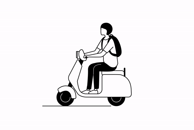


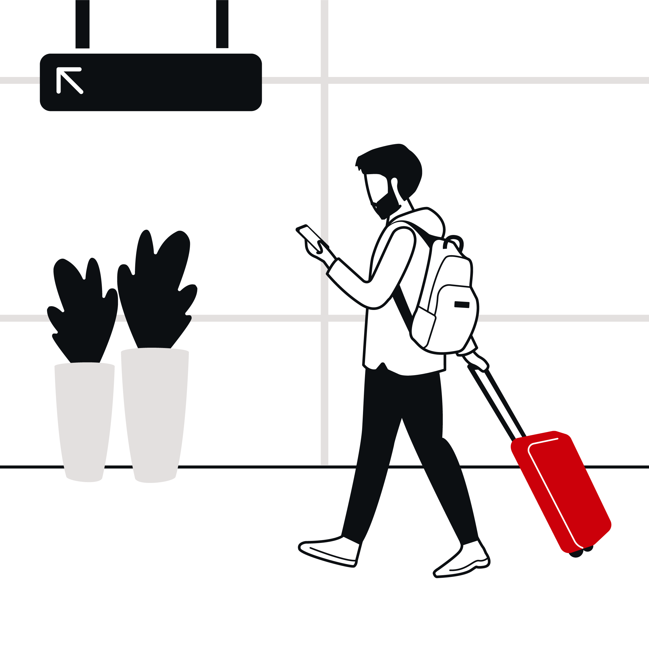


Our approach to photography brings the human touch. The protagonists are diverse and ‘real’, and are depicted in organic, authentic, quirky, fun ways.
Creatives will depict people interacting with their devices: a feature of everyday life and prevailing culture that has been around us for a decade.All pictures—whether exciting, amusing, adorable, or mundane—should look like ‘moments in time’.


RoleArt Direction, Illustrator
TeamCreative Lead: Kunel Gaur, Sayantan Chaudhary
Art Direction: Yash Prajapati, Clementine Le Gall, Naveed Hussain, Parul Aden, Samya Ghosh, Sugandha Kharya
Copy: Prakhar Khandelwal, Sheetal Raghav, Simran Bhalla
Motion Design: Pranay Patwardhan, Vishank Kumar
Account Management: Sharon Borgoyary, Shruti Aggarwal, Anindita Biswas, Ankrish Khanna
Photography: Colston Julian
BrandAirtel